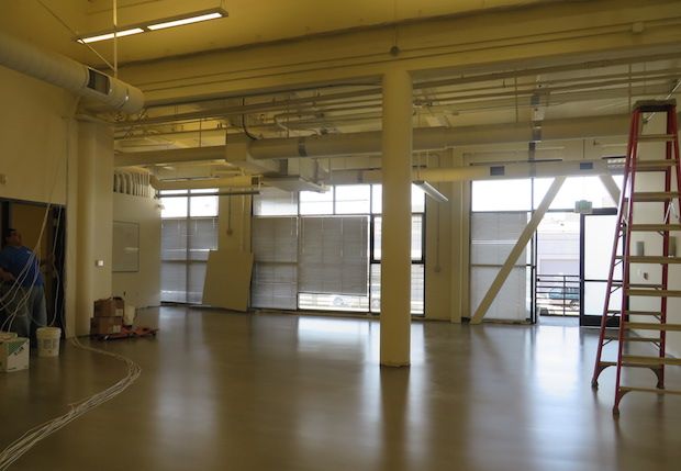
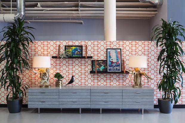
I always appreciate a BEFORE and AFTER series showing the design transformation of a space. So I thought I would share just that from my latest completed project. I worked on a
SF based video game developing company over the course of 5 months and the end result was something both the clients and I were super happy with.
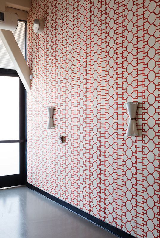
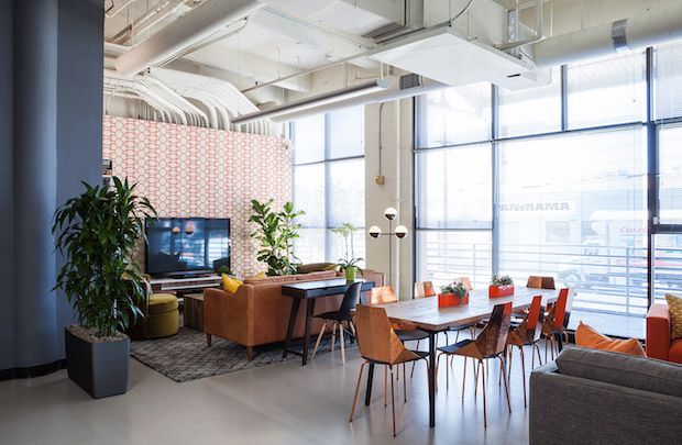
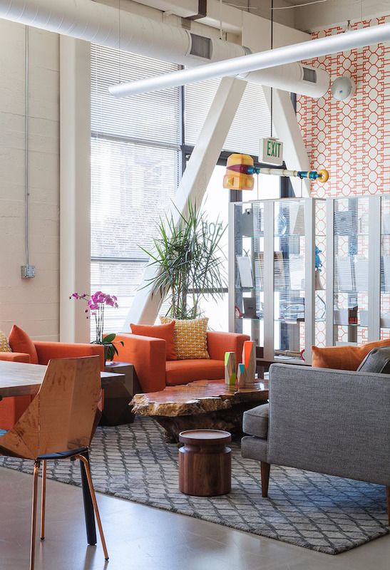
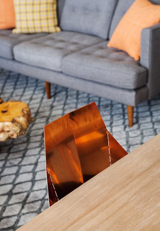
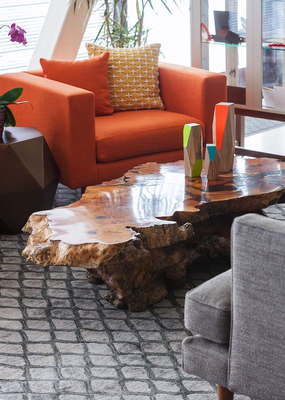
The initial concept was to divide the large open space into specific work areas while creating spaces that felt natural, residential, interesting and timeless. While we did use some graphic wall treatments and textures we didn't want the space to feel gimmicky and for the impact of the time and money spent on the design to lend itself for the years to follow. Incorporating natural textures (like the reclaimed redwood you will see) and plants were crucial for the clients and helped to take some of the sterilized feeling of an indoor workspace away. By adding layers of light throughout the office, the employees could switch on all the decorative lighting during the day without having the overhead florescent lights on - which as most of us know, can make you feel like a zombie after spending hours in the green glow.
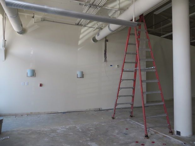
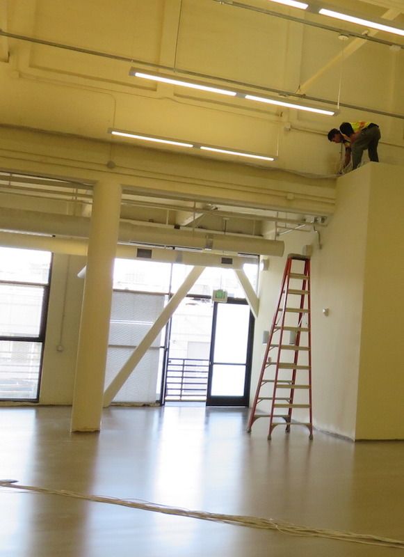
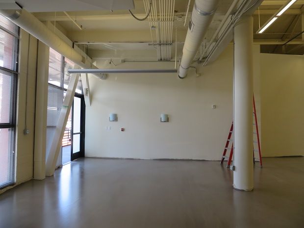
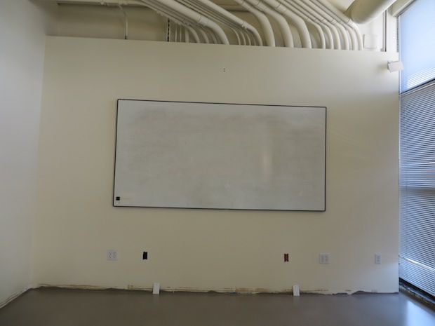
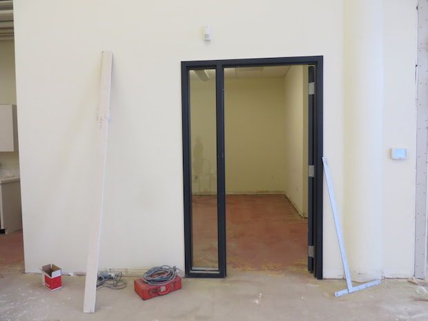
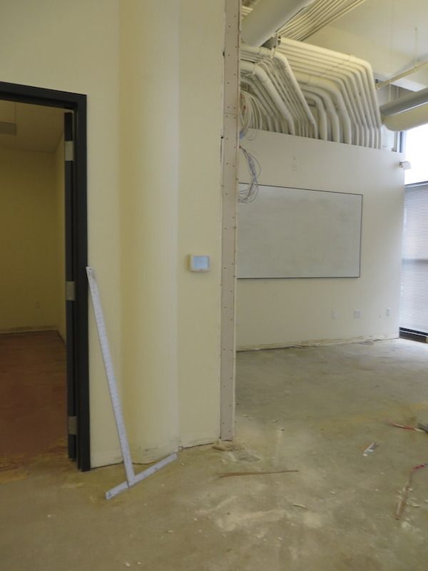
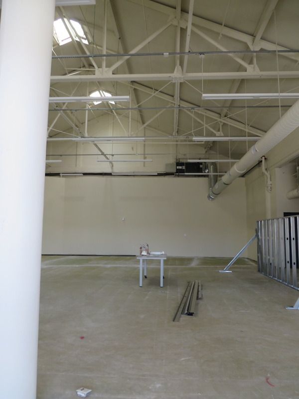
The front area started off with all white walls......
and a really open floor plan:
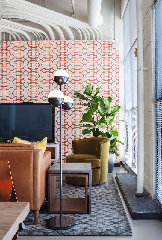
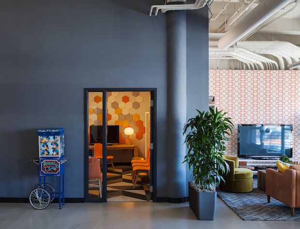
After developing floor plans we created three separate areas that all function for specific tasks within the company:
BEFORE....
and AFTER:
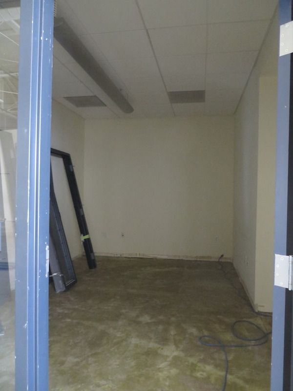
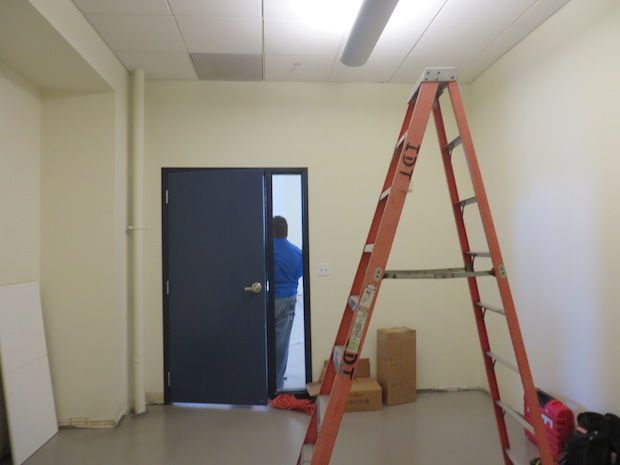
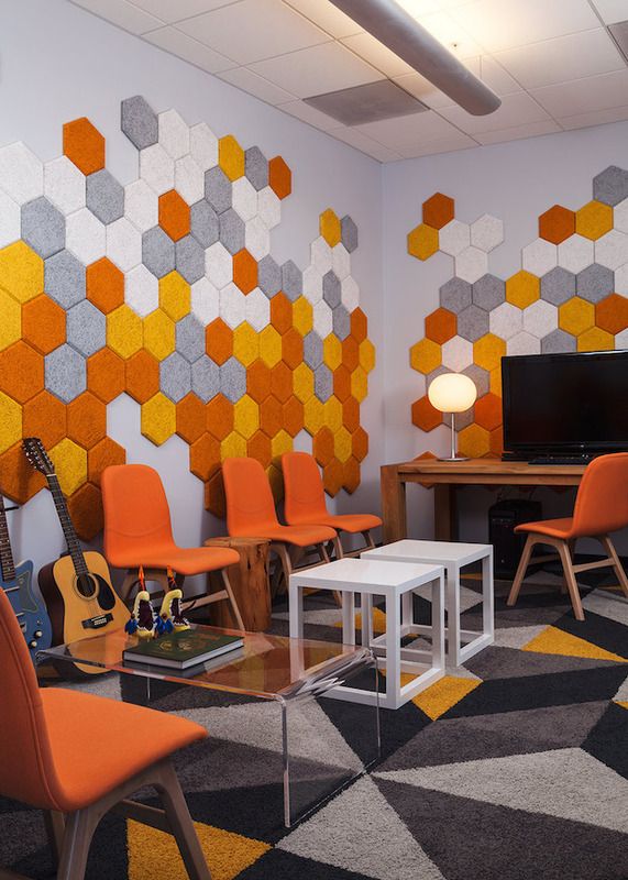
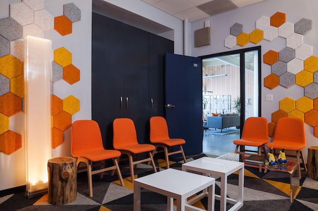
The meeting room was the perfect place to make into a music/recording room - complete with these amazing acoustic tiles from
BAUX and
FLOR tiles to further absorb sound....BEFORE:
and AFTER:
more BEFORES:
and AFTER:
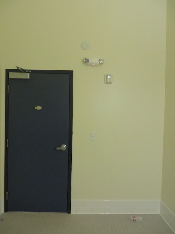
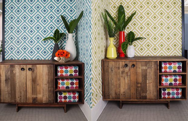
The bathrooms needed a major kick in the pants. Without spending a ton of money we landed on this fun
David Hicks wallpaper - a different color in each bathroom - and a modern/rustic storage cabinet to take them from drab and sad to super fun (if you ask me):
super scary
super fun
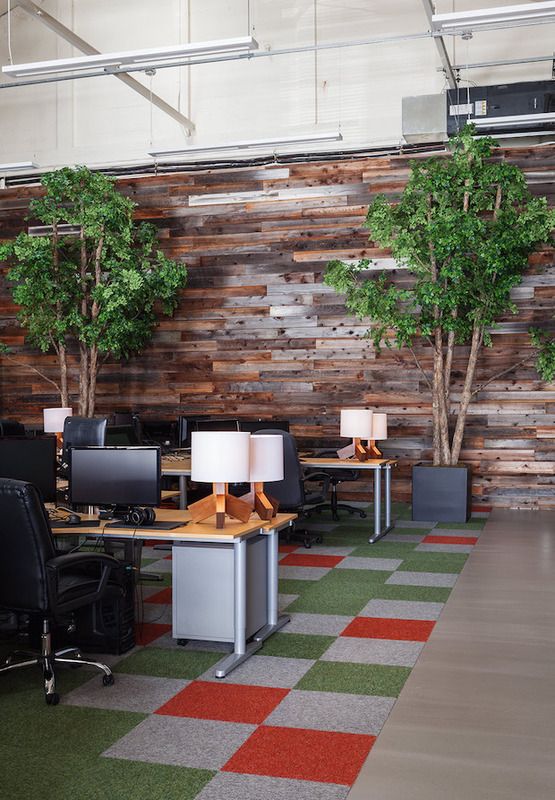
The work/desk area created a challenge with it's huge backdrops of white walls....these seemed like the perfect place to wrap in reclaimed redwood and instantly added a ton of warmth and coziness to the space. We used
FLOR tiles again (for color and texture) and brought in 14' tall, faux ironwood trees to add drama and ground the back part of the room.....here's a BEFORE:
and AFTER:
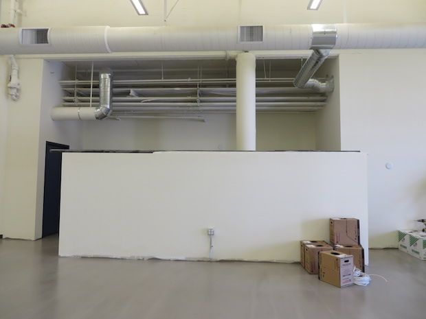
In the same work space was a pony wall dividing the kitchen. To create more storage space we added a few case pieces and repeated the wallpaper found at the front of the space. BEFORE:
and AFTER:
This was a really fun project. The clients were amazing and were totally game to incorporate some new and fun elements into their space. More like these, please!
all BEFORE images by Janel Holiday Interior Design....all AFTER images by Michele Lee Willson Photography. Be cool and ask for permission before using, k? Thanks.

