Monday, December 13, 2010

obsessed with Mark Cunningham's nyc HOME IN THE SKY....

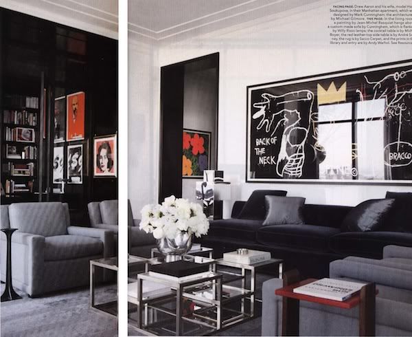
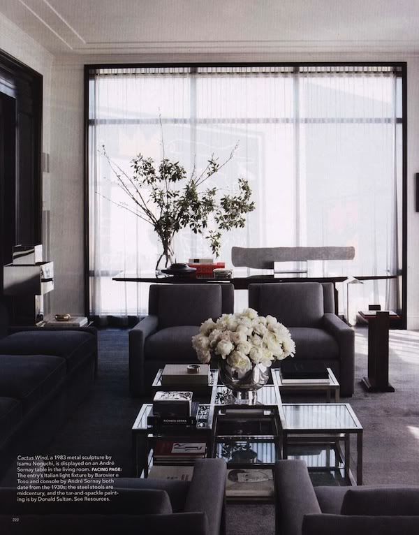
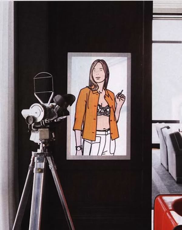
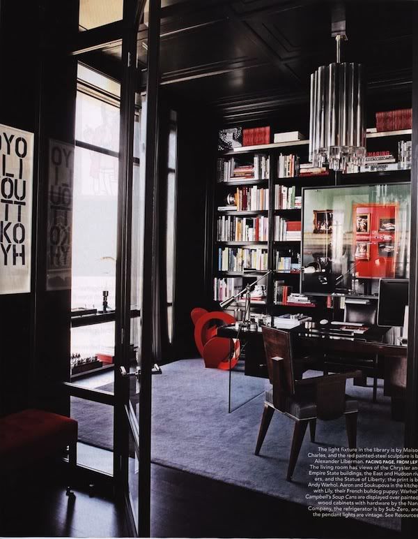
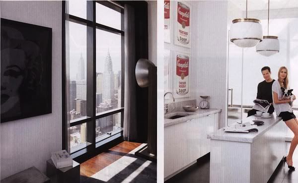
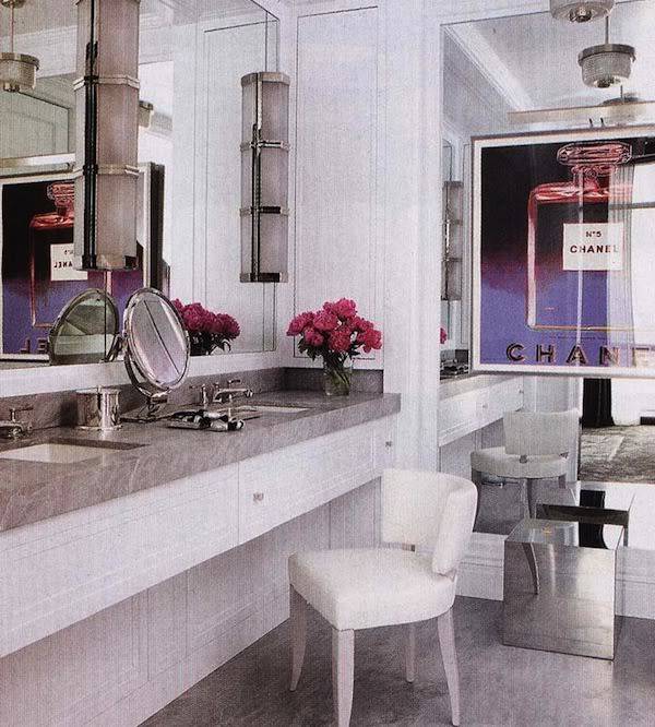
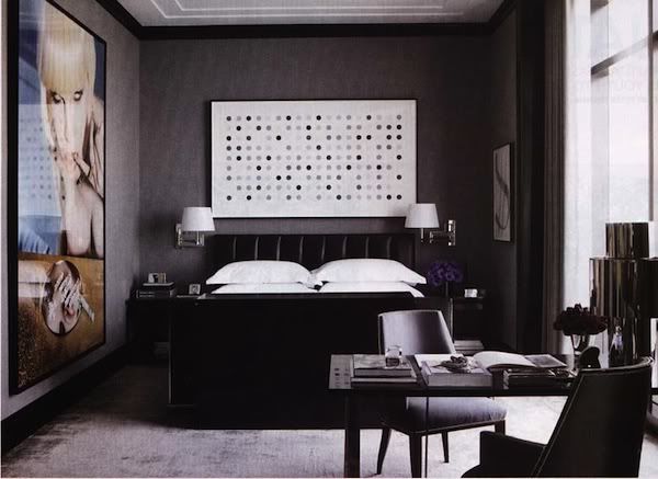
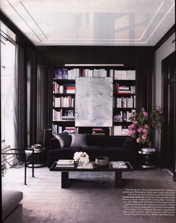
if you have been to my casa then you have probably thought to yourself..."good lord, those two sure do like to hold onto their magazines....wth?"  'tis true.  my hub and i love our glossy monthly tangible mini-books of inspiration.  although i am now at a point of actually RIPPING my Domino collection (gasp!) apart and organizing it per appropriate inspired image...we still seem to accumulate several, small colorful mountains of mags in our home.  what are you getting at, janel?!  well, this all being said, it is VERY rare that i have a mag hang out on my nightstand for longer than a few weeks.....i try to make it a point to change it out....but I have held onto the October issue of Elle Decor for the simple reason below.  I am obsessed with the apartment that Mark Cunningham did for model Hana Soukupova and paper distributer (not your Dwight Schrute) husband  Drew Aaron.  i can't get it off my nightstand because i keep picking it up and looking at the interiors.  I think what i love so much is not only the harmonious color palette and flow from room to room of blue-grays, Hermes orange, charcoal, navy, glossy white, etc. but is the mix of traditional architecture and modern/vintage furniture....mixing new fabrics and textures with custom upholstery and unique vintage pieces and lighting.  the super lacquer painted ceilings are luxe and fresh - perfect for this hip and handsome young couple.  all this genius interior work creates the perfect backdrop to their INSANE collection of drool-worthy art including; jean -michel basquiat, warhol, david lachapelle, donald sultan, damien hirst and numerous others....including scuplture by isamu noguchi....seriously?? AND she's a model?? i know.....right?


on a side note, my office was so inspired by the michel boyer multi-level coffee table in the living room that we actually stalked and presented one to a client that we were fortunate enough to install in their home.  a true gem of furniture that is not seen often in print or in person.  


without any narrative, please find below this beautiful home shot by William Abranowicz with interior design by Mark Cunningham and architecture by Michael Gilmore.


Photobucket
living room.....michel boyer coffee table

Photobucket
living room

Photobucket
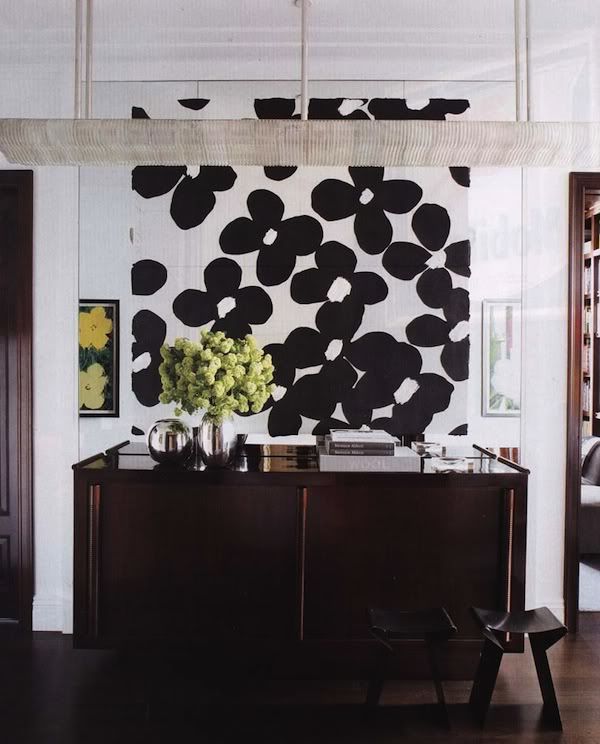
entry with andre sornay credenza....swoon...

Photobucket
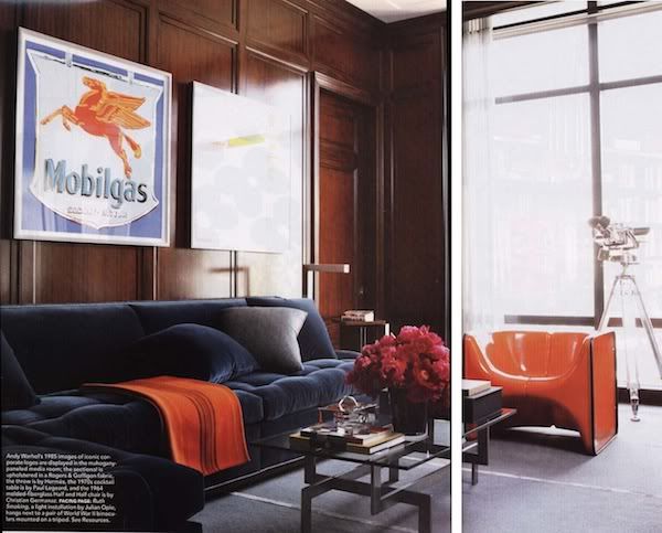
media room

Photobucket

Photobucket
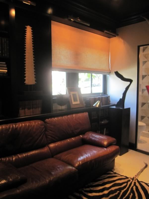
library

Photobucket
cute couple, right?!

Photobucket
dressing room cuteness...

Photobucket
master

Photobucket
master sitting

soundtrack for this visual stunner:


"pictures of you"....by the cure, of course.


Sunday, December 12, 2010

...inspired by Miu Miu for my HOLIDAY table...(in case you missed my guest blog on Stylish Bird)!

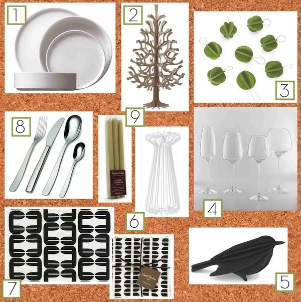
For my holiday table this year I am inspired by Miu Miu’s Fall/Winter 2010 ad campaign.  Miu Miu is always forward thinking with their mix of materials, patterns, textures and colors.  always fabulous – always with a surprise thrown in.

Photobucket

Photobucket

Photobucket


  1. concise + clear shapes: simple white dishes from cb2
  2. unexpected texture: birch plywood trees.  I am loving everything from Lovi right now – a Finnish design company that creates “visually sophisticated and enchanting three-dimensional objects based on a patented joint system”…via DesignStory – where they have an awful good deal going on right now with all things Lovi. I would start off with several of their 13” high birch plywood Christmas Trees loading up the center of the tables.
  3. cool color: all light green Miniballs by Lovi would decorate the trees. They look like little felt origami jems and remind me of those great lavender wool pockets above.
  4. nod to the past: Rosenthal TAC 02 stemware by Walter Gropius
  5. animal-life: Miu Miu used the swallow heavily on their Spring shoe line and I would place these cuties (again, Lovi) on every plate with a handmade place card.
  6. sculpture: loads of candlelight with these candlesticks from IKEA.
  7. graphic power: these cotton and linen placemats and napkins by Dwell Studio give just the right grounding power and fun element…reminiscent of the cutouts in the Miu Miu dresses.
  8. hardware: the knifeforkspoon flatware set by Jasper Morrison for Alessi is elegant but edgy. 
  9. one more pop of color: taper candles from Sur La Table.


of course, you need some tunes - my three favorite holiday albums:


Monday, November 29, 2010

stopping by STYLISH BIRD for a little guest bloggin'....!

i had a wonderful experience in partaking in my fellow interior designer's blog - Amanda Teal @ Stylish Bird this week.  Amanda has been running a series of tablescapes by other designers/bloggers and I was thrilled to participate.  Amanda has a clean, refreshing and honest approach to design.  I always appreciate her inspiration and thoughts.  Girl has got some crazy talent and she happens to be super cute to boot!  


thanks for having me, Amanda!!  xoxo jhh

Tuesday, November 23, 2010

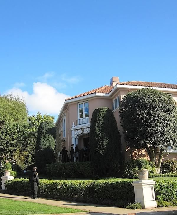
San Francisco's FIRST Elle Decor Showcase House

What better way to spend an hour on a blustery and off-and-on rainy Saturday than indoors at the cozy Elle Décor’s first ever San Francisco Showcase House?!

Photobucket

After meeting up with my co-workers Jaimie and Susan, we ventured inside in complete anticipation – hoping that the rooms would mimic the pages of a favorite magazine for me (I prefer the UK Edition). 

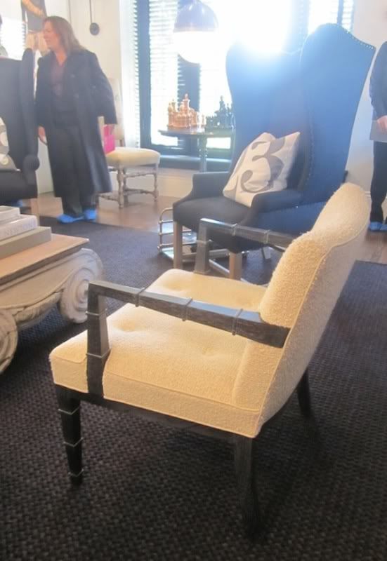
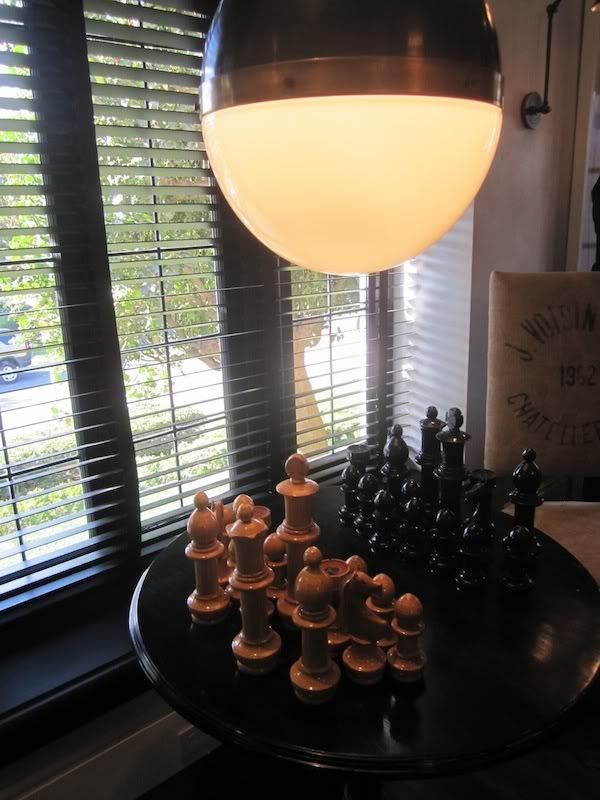
We started off in Gary Spain’s Living Room where he paired botanic elements with rustic natural fabrics, knubby linens, burlap and boucles (like the creamy boucle on the Billy Haines pair of chairs) and stone elements like the chunky, over scaled chess set – which I thought was genius.  The scale lent a playfulness to what I think people tend to think of as a serious game (on a side note…my father taught me how to play chess when I was YOUNG and it remains one of my favorites to this day…now searching for a chess set – let me know of any great sets I must be made aware of!).

Photobucket

Photobucket

Photobucket

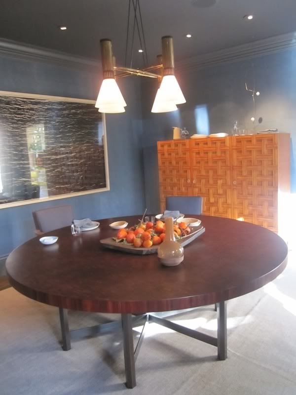
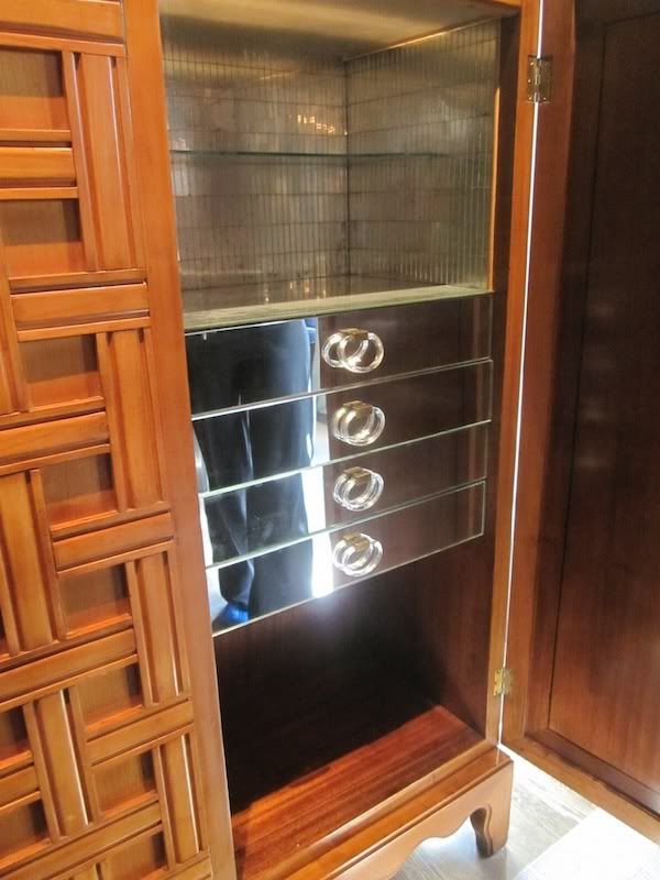
Stephen Volpe always turns it up to a solid 10 – and with the Stilnovo chandelier (you had me at vintage Italian lighting, Stephen), massive Richard Misrach photograph and 1940s Paola Buffa lattice cabinet by I was sold.  The beautiful table by Jules Wabbe (from his own gallery, Hedge) was a perfect cast of wood tones. 
Photobucket
Photobucket
detail of cabinet...swoon!

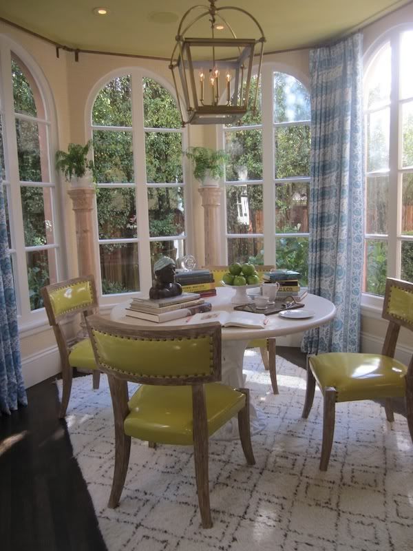
The Breakfast Room by Palmer Weiss was bright, charming and cheerful – three great adjectives that you want to incorporate into the overall mood and look of this room in my book! The chairs from Ironies looked amazing in a yellow patent leather with nailhead detail (I LOVE all the tessellated bone pieces Ironies is doing right now…as a matter of fact, I am on board for almost everything they are doing right now). I’m a huge fan of Phillip Jeffries wallpapers and I think she chose the perfect grasscloth color – not too yellow and not too muddy.  And, who doesn’t love a Moroccan Beni Ourain rug ?!  You can buy the same one shown here at William Sonoma….A+A = adorable and affordable = TLA! 

Photobucket

Photobucket
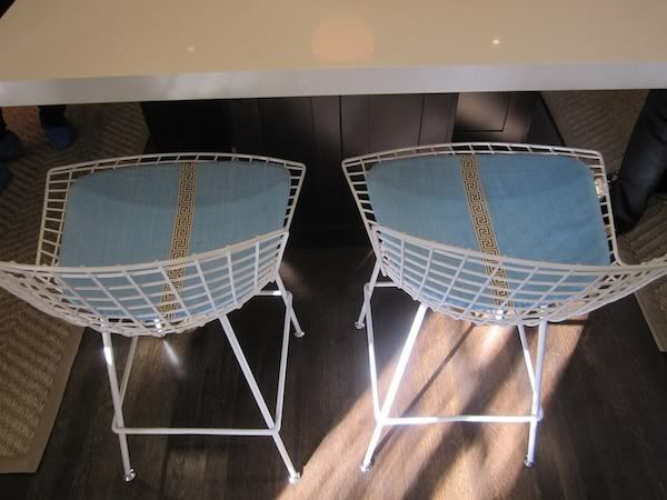
detail of Saarinen stools in the Kitchen

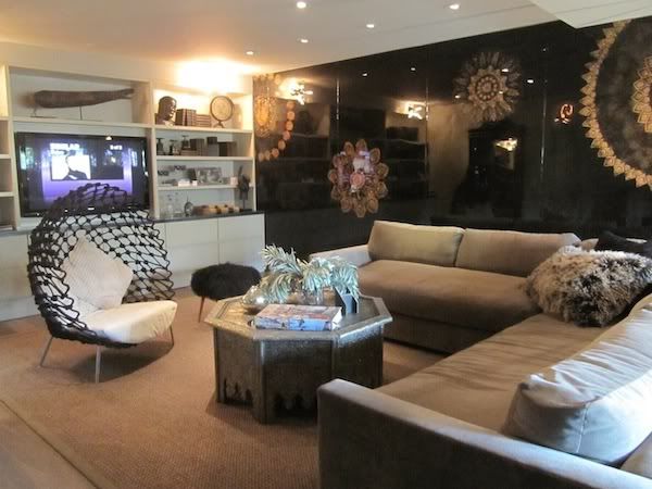
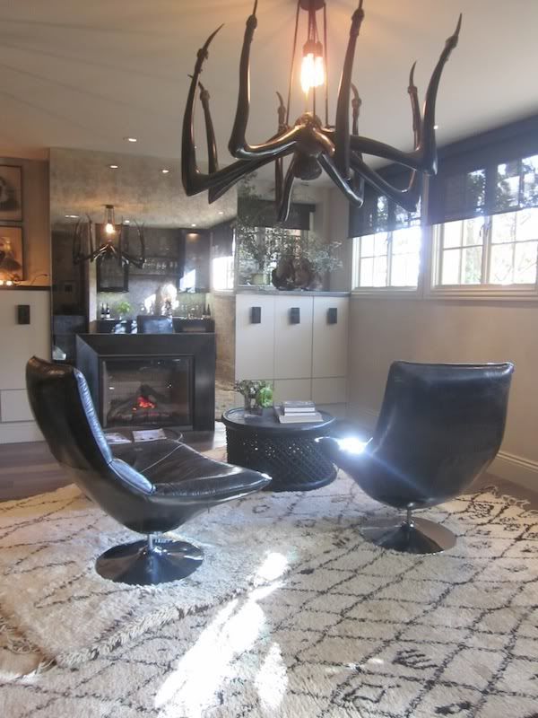
Pulling out all the tricks is pretty common for these showcase homes and Erin Martin did just that with her Media Room.  I thought it worked pretty well and the spider-esque chandelier ( I wish I knew where this was from/who it is by!!) is fab.  I would never be able to live with it, but in this space it was super fun and worked well with all of her layering efforts of trades, materials, textures and styles. 

Photobucket

Photobucket

Photobucket
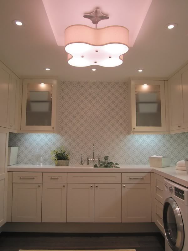
pretty Laundry Room by Erin Martin

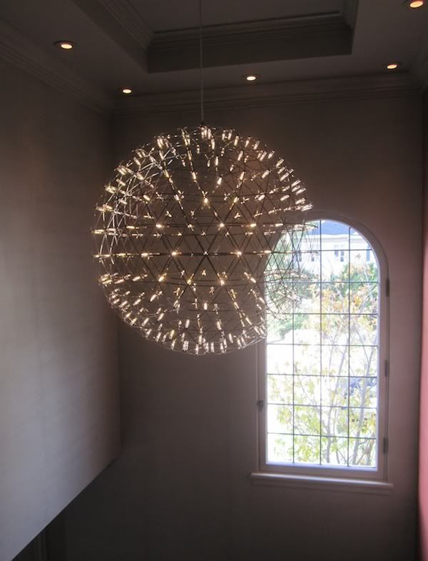
Moving upstairs was this stunner by Mooi Lighting – I am driving my husband crazy now with where and how can we put this in our house??!?  Did you just say, “above your Dining Room table, Janel, duh.”?  Funny, that is exactly what I thought too.

Photobucket

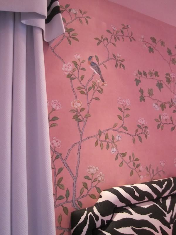
Grant Gibson’s “tween-centric” Bedroom featured a beautiful De Gournay (hand painted) wallpaper with funky, upholstered, zebra-print headboards and Billy Baldwin inspired cornice/curtains…
Photobucket

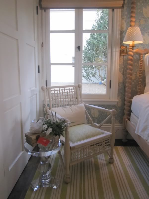
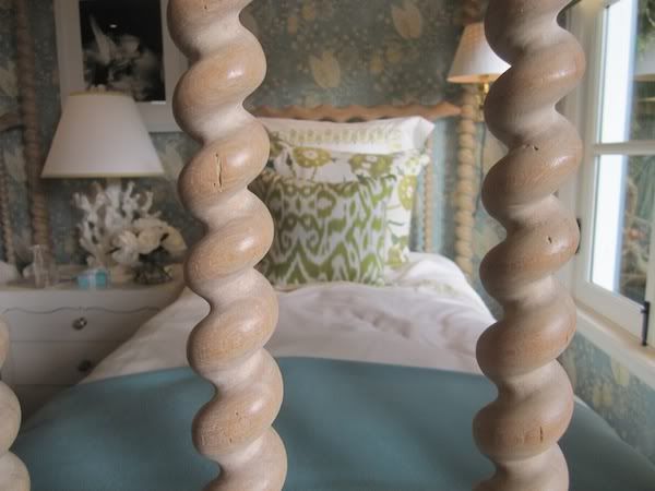
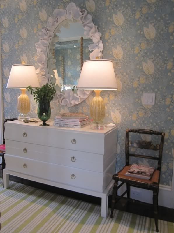
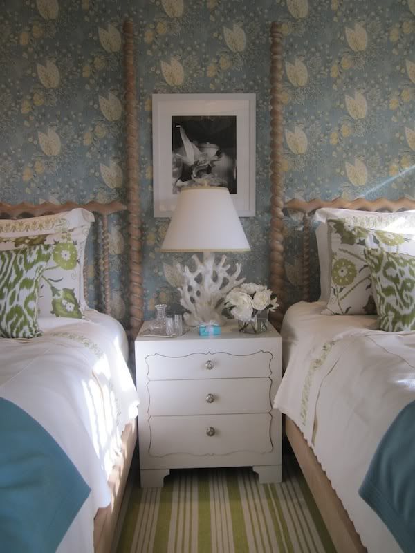
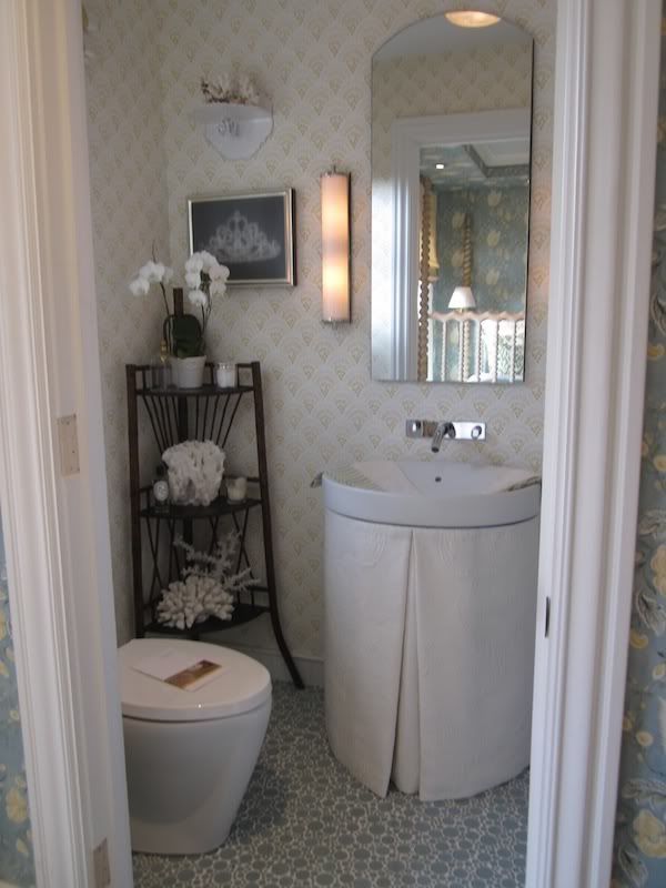
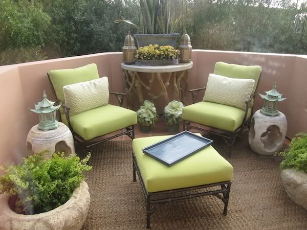
Suzanne Tucker’s Guest Bedroom and Bathroom were completely “done’….everything worked, everything matched, it all worked SO well together.  For some, this “done” look can be a bit much while for me I am so Type A, that I can appreciate everything having its place and purpose.  I loved the white lacquer dresser by Paul Laszlo (‘natch) and the color palette was beautiful.  Suzanne Tucker used her own fabric (recently published in Paris this year) on the walls and I thought it was lovely.
Photobucket

Photobucket

She also brought in mineral elements to this room, which she used heavily in the Dining Room she did earlier this year for the San Francisco Showcase House…a detail that I personally adore.

Photobucket

Photobucket

Photobucket

Photobucket

Photobucket
balcony off of Guest Bedroom also by ST

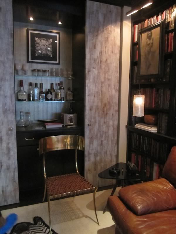
Will Wick proved to be a master of taking a small space and making it seem MUCH larger and grand than the square footage would suggest.  His Library was rich, comfortable and hip.  I especially loved this Klismos chair by Joy Kennedy Collection. 

Photobucket

Photobucket

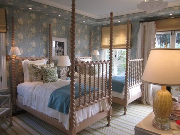
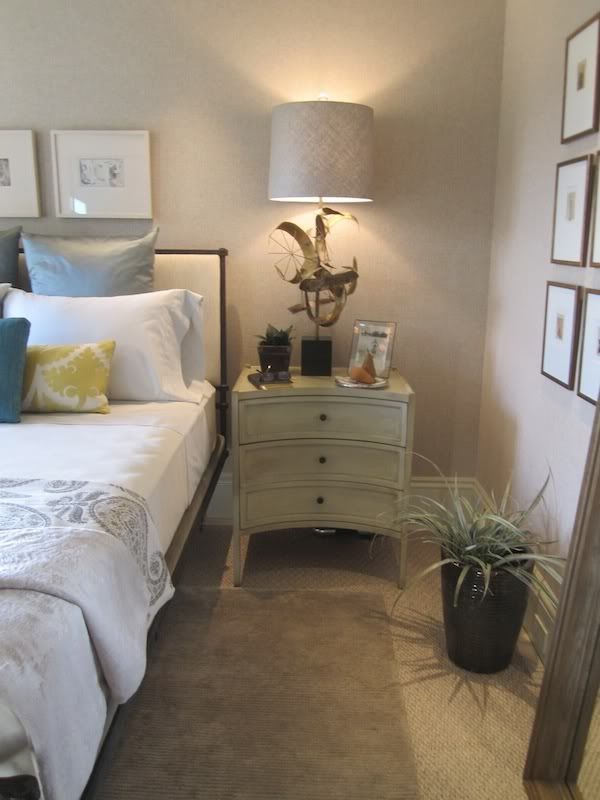
Elizabeth Martin’s Guest Bedroom was simple and calm.  I thought her custom designed (by herself) forged iron bed was fantastic.  And the Curtis Jere table lamps were beyond amazing.   I can’t get them out of my head. 
Photobucket

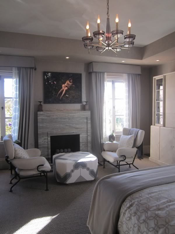
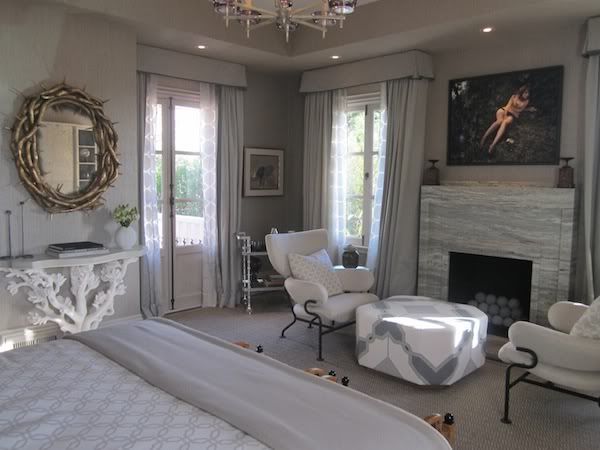
My personal favorite room was Jay Jeffer’s Master Bedroom…it evoked the feeling of being wrapped up in a gray, cashmere throw, sipping a glass of bubbly, with a roaring fire going and Valley of the Dolls on the ’tube…. too much?

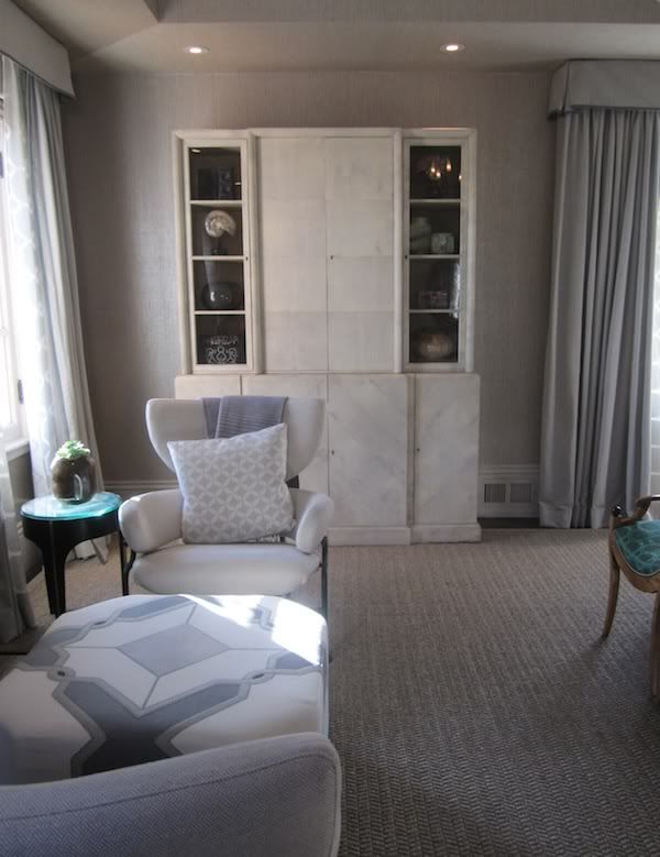
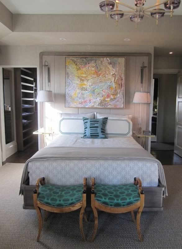
His walls were covered in a silver gray grasscloth, which came across as warm and comforting.  The parchment cabinet by Samuel Marx was a showstopper – a creamy jewel of a piece.  The silver travertine mantle (by Fox Marble) was perfectly modern without being TOO modern and brought in an interesting pattern.  Loved the floor to ceiling headboard with sconces, bar cart, console and pair of club chairs by Franco Albini.

Photobucket

Photobucket

Photobucket

The unexpected pop of malachite green fabric on a pair of 30s Swedish stools was enough to being you back down to earth.

Photobucket
Fabulous job.


Soundtrack for this fun house of design?  A favorite 50s homemaker of mine, Peggy Lee, of course!
Photobucket


ps - all photos by me


Thursday, November 18, 2010

the Rug Company Goes Royal....Alexander McQUEEN....love...

To say that the passing of Alexander McQueen came as a total shock doesn’t get close to what a tragedy his death meant to the world of design.  His innovative, forward-thinking and passionate emotion that he thrust into his work maybe was the end all for him.  Maybe he gave so much that it left him feeling THAT empty.  I don’t know…for someone as talented as him to take their own life leaves me so baffled.
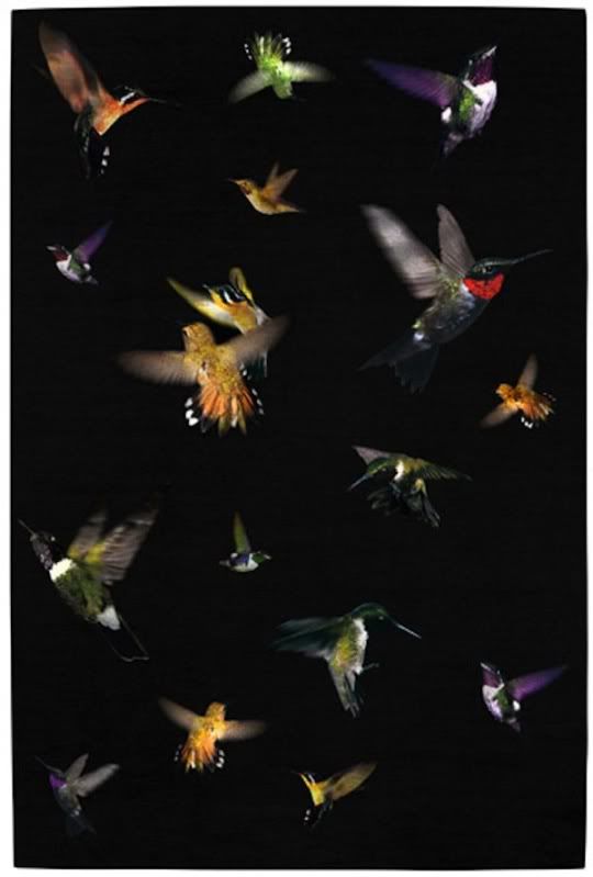
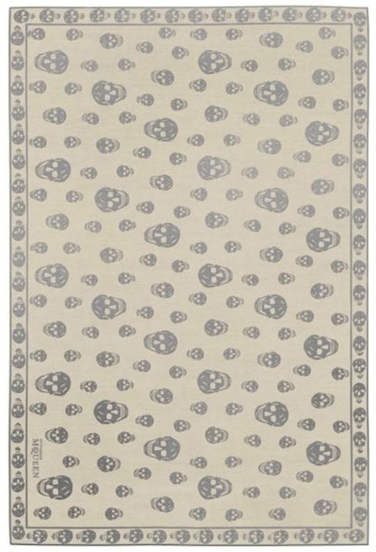
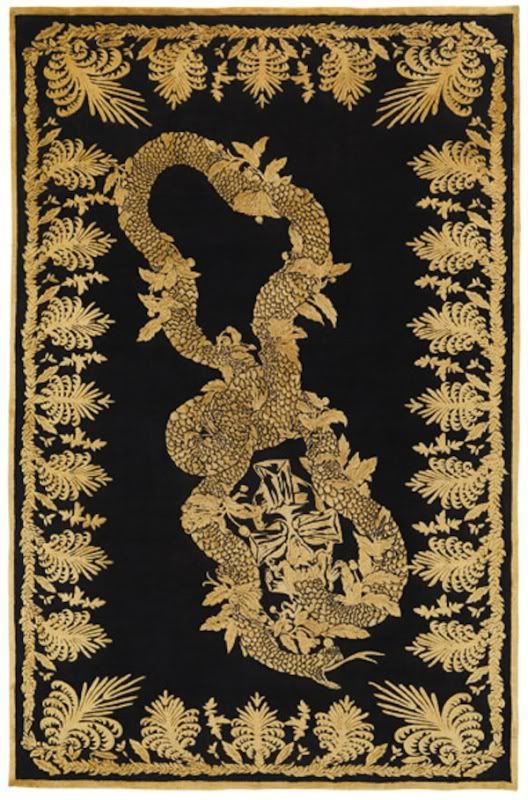
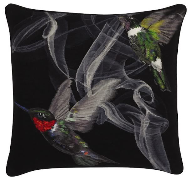
Thank goodness his work lives on and his iconic look (i.e skull) can be re-lived with the Rug Company’s edition of four area rugs and three cushions.  I love how his historical-meets-modern world-meets edgy-meets fantasy-meets genius perfectly translates to the Rug Company’s motto of “meticulous craftsmanship with that extra ingredient, the talent of the world’s most distinguished and experienced designers. They know how to combine modern design flair with traditional techniques. They reinvigorate this age-old craft and make us look at the rug with a fresh eye. Together we create rugs that we believe to be precious, unique and to have long-lasting value”.
Enjoy.

Photobucket
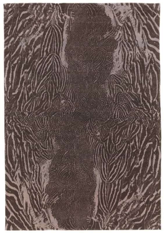
"feathers"....cashmere + wool

Photobucket
"hummingbird"....wool + metallic thread...i think this would be so amazing in a media room....keep it dark.

Photobucket
"skull"....wool + silk

Photobucket
"military brocade"....wool + silk

Photobucket
"hummingbird cushion"....wool + metallic thread

Photobucket
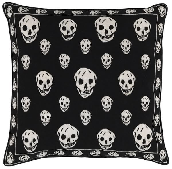
"skull black"....wool cushion

Photobucket
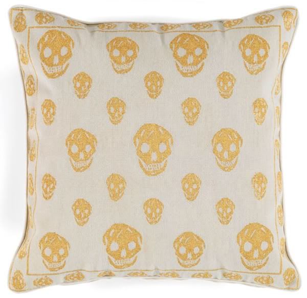
"skull gold"....wool cushion

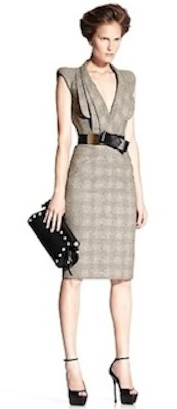
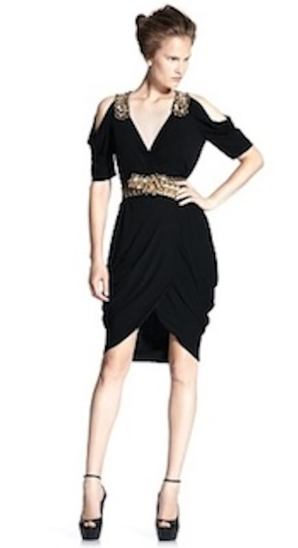
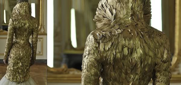
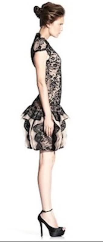
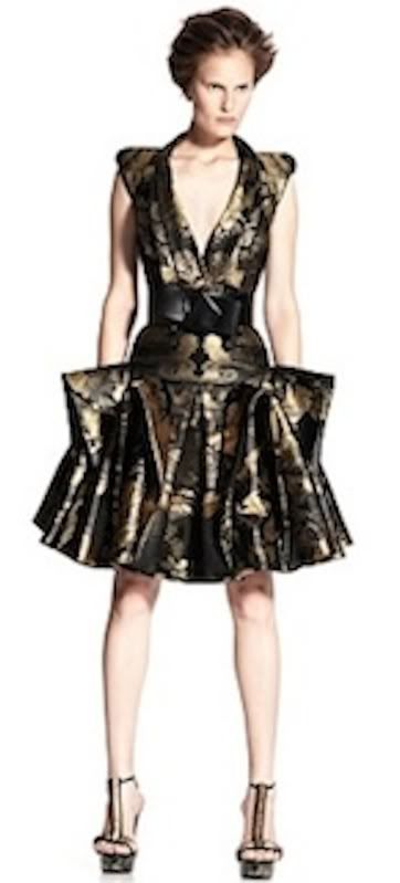
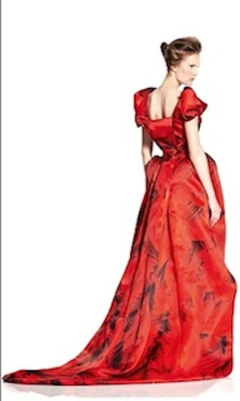
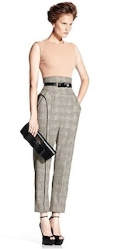
a few of my favorite looks from Fall/Winter 2010 + Spring/Summer 2011 ( i would post every single look from Spring/Summer 2011 by the way...it's beyond.)


Photobucket

Photobucket

Photobucket


Photobucket

Photobucket

Photobucket

Photobucket

all rug + cushion images from Rug Company.
all Mcqueen gorgeousness from the Alexander McQueen website.


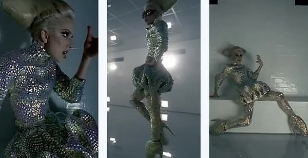
Soundtrack for this swoon worthy bounty: his latest fan, Lady Gaga, of course.


Photobucket