thanks for having me, Amanda!! xoxo jhh
Monday, November 29, 2010
stopping by STYLISH BIRD for a little guest bloggin'....!
i had a wonderful experience in partaking in my fellow interior designer's blog - Amanda Teal @ Stylish Bird this week. Amanda has been running a series of tablescapes by other designers/bloggers and I was thrilled to participate. Amanda has a clean, refreshing and honest approach to design. I always appreciate her inspiration and thoughts. Girl has got some crazy talent and she happens to be super cute to boot!
Tuesday, November 23, 2010
San Francisco's FIRST Elle Decor Showcase House
What better way to spend an hour on a blustery and off-and-on rainy Saturday than indoors at the cozy Elle Décor’s first ever San Francisco Showcase House?!
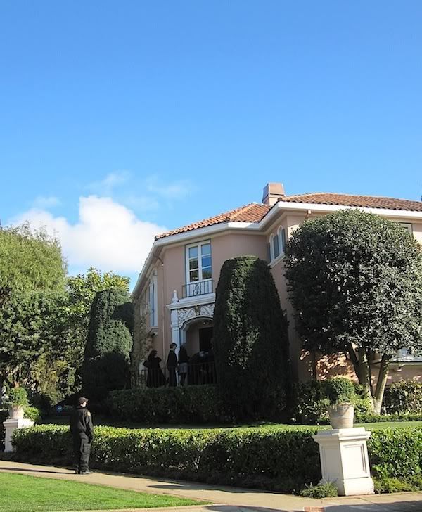
After meeting up with my co-workers Jaimie and Susan, we ventured inside in complete anticipation – hoping that the rooms would mimic the pages of a favorite magazine for me (I prefer the UK Edition).
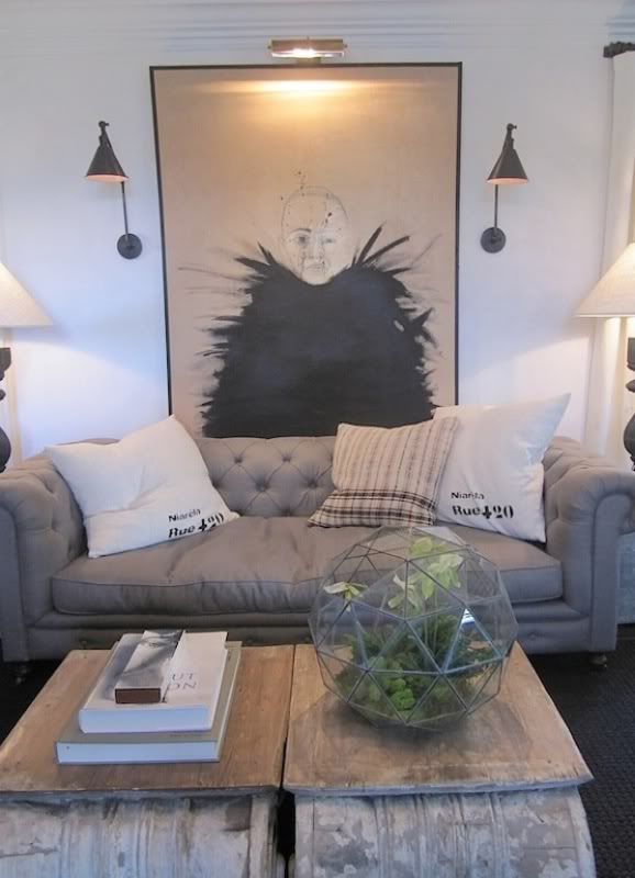
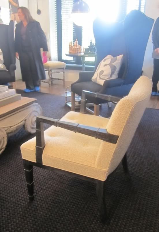
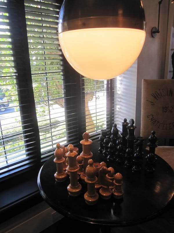
We started off in Gary Spain’s Living Room where he paired botanic elements with rustic natural fabrics, knubby linens, burlap and boucles (like the creamy boucle on the Billy Haines pair of chairs) and stone elements like the chunky, over scaled chess set – which I thought was genius. The scale lent a playfulness to what I think people tend to think of as a serious game (on a side note…my father taught me how to play chess when I was YOUNG and it remains one of my favorites to this day…now searching for a chess set – let me know of any great sets I must be made aware of!).
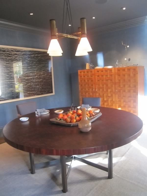
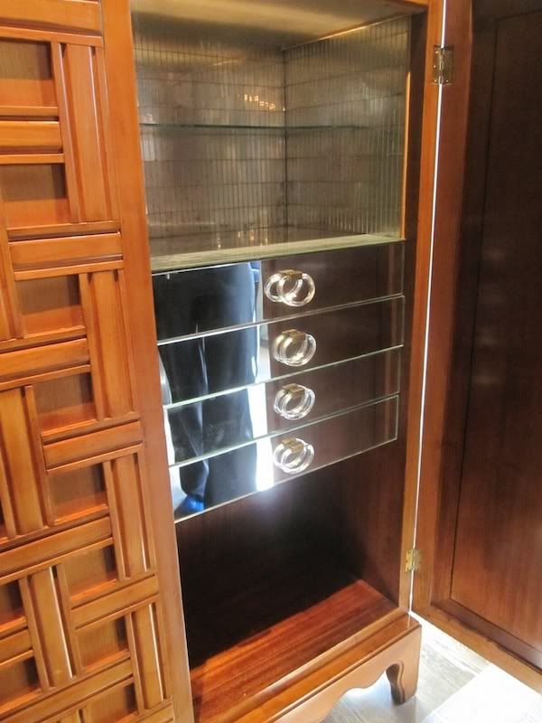
Stephen Volpe always turns it up to a solid 10 – and with the Stilnovo chandelier (you had me at vintage Italian lighting, Stephen), massive Richard Misrach photograph and 1940s Paola Buffa lattice cabinet by I was sold. The beautiful table by Jules Wabbe (from his own gallery, Hedge) was a perfect cast of wood tones.
detail of cabinet...swoon!
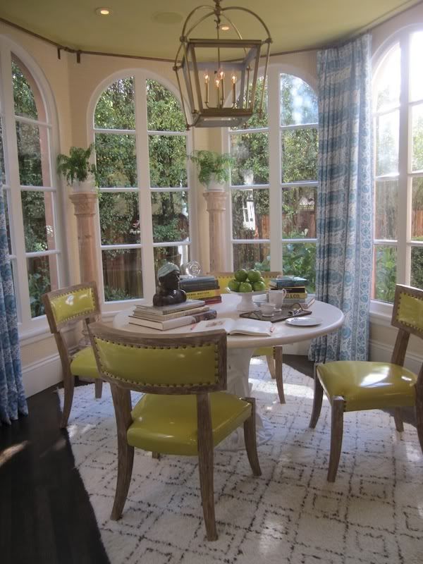
The Breakfast Room by Palmer Weiss was bright, charming and cheerful – three great adjectives that you want to incorporate into the overall mood and look of this room in my book! The chairs from Ironies looked amazing in a yellow patent leather with nailhead detail (I LOVE all the tessellated bone pieces Ironies is doing right now…as a matter of fact, I am on board for almost everything they are doing right now). I’m a huge fan of Phillip Jeffries wallpapers and I think she chose the perfect grasscloth color – not too yellow and not too muddy. And, who doesn’t love a Moroccan Beni Ourain rug ?! You can buy the same one shown here at William Sonoma….A+A = adorable and affordable = TLA!
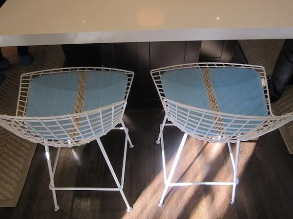
detail of Saarinen stools in the Kitchen
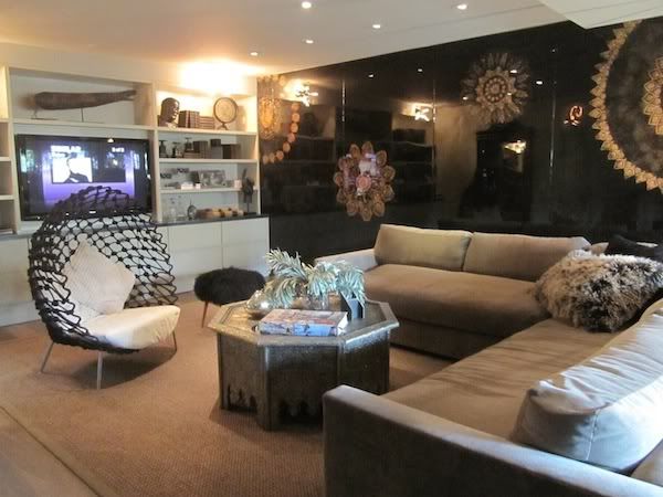
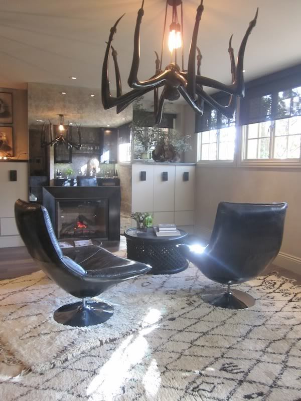
Pulling out all the tricks is pretty common for these showcase homes and Erin Martin did just that with her Media Room. I thought it worked pretty well and the spider-esque chandelier ( I wish I knew where this was from/who it is by!!) is fab. I would never be able to live with it, but in this space it was super fun and worked well with all of her layering efforts of trades, materials, textures and styles.
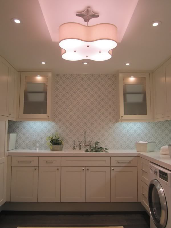
pretty Laundry Room by Erin Martin
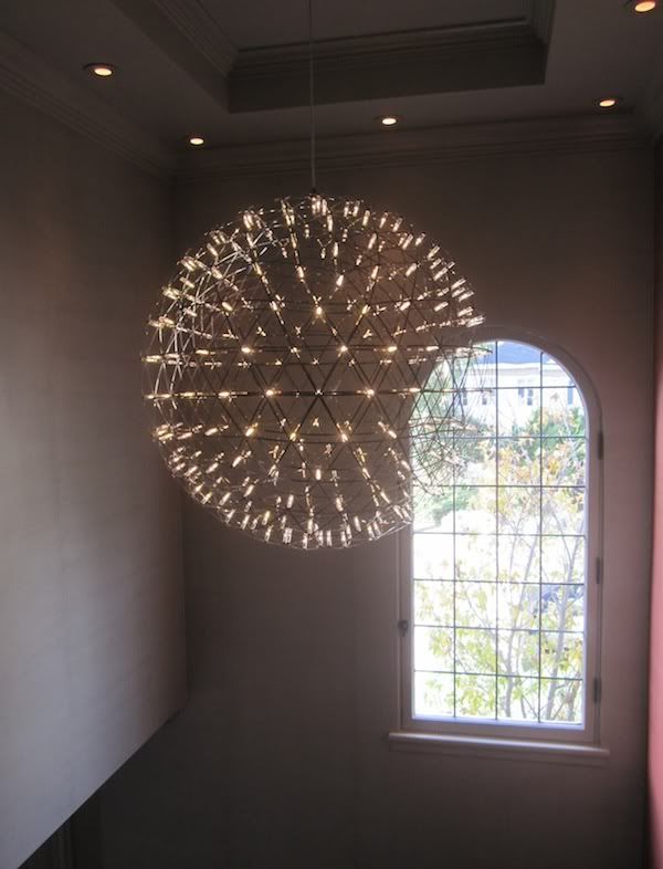
Moving upstairs was this stunner by Mooi Lighting – I am driving my husband crazy now with where and how can we put this in our house??!? Did you just say, “above your Dining Room table, Janel, duh.”? Funny, that is exactly what I thought too.
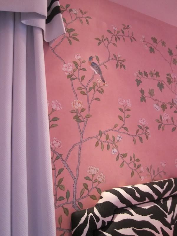
Grant Gibson’s “tween-centric” Bedroom featured a beautiful De Gournay (hand painted) wallpaper with funky, upholstered, zebra-print headboards and Billy Baldwin inspired cornice/curtains…
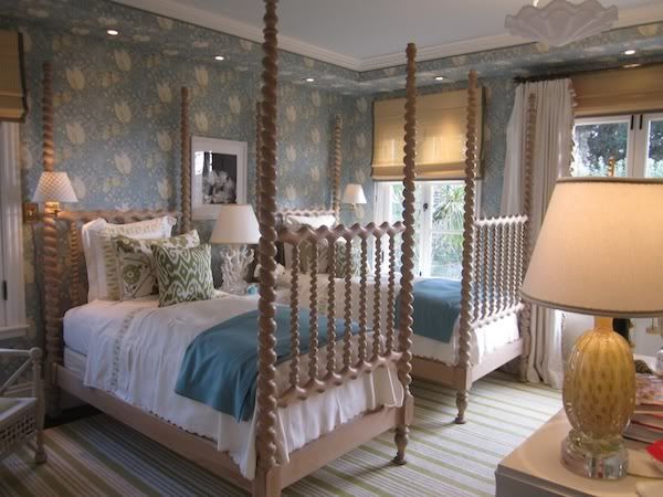
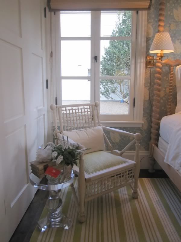
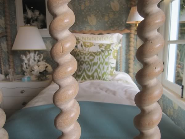
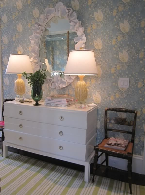
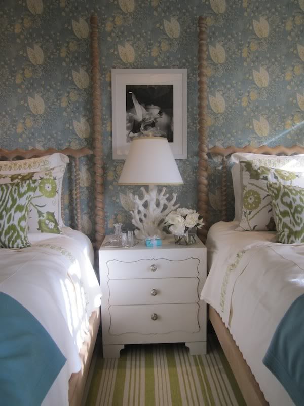
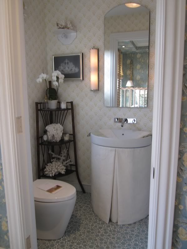
Suzanne Tucker’s Guest Bedroom and Bathroom were completely “done’….everything worked, everything matched, it all worked SO well together. For some, this “done” look can be a bit much while for me I am so Type A, that I can appreciate everything having its place and purpose. I loved the white lacquer dresser by Paul Laszlo (‘natch) and the color palette was beautiful. Suzanne Tucker used her own fabric (recently published in Paris this year) on the walls and I thought it was lovely.
She also brought in mineral elements to this room, which she used heavily in the Dining Room she did earlier this year for the San Francisco Showcase House…a detail that I personally adore.
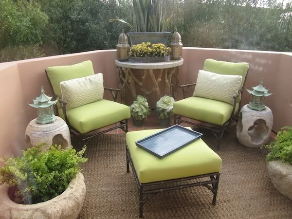
balcony off of Guest Bedroom also by ST
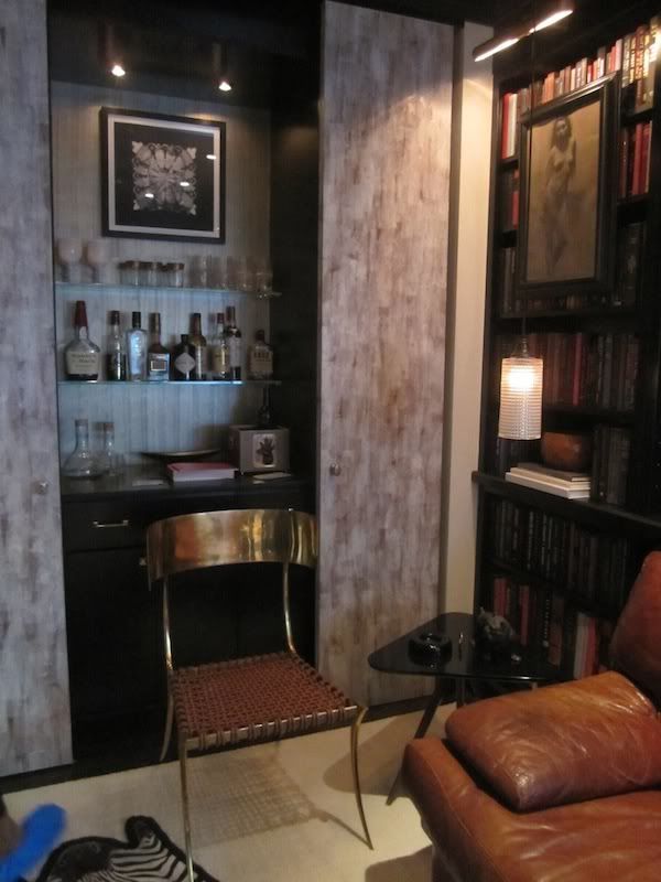
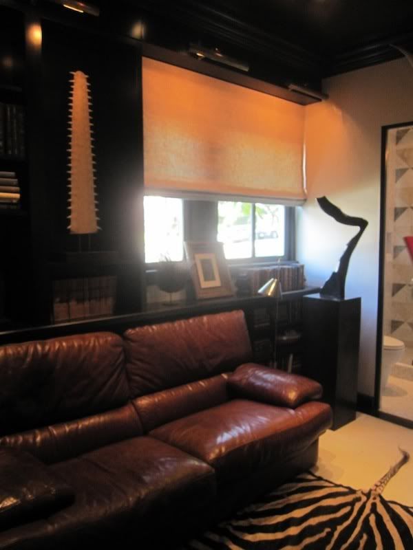
Will Wick proved to be a master of taking a small space and making it seem MUCH larger and grand than the square footage would suggest. His Library was rich, comfortable and hip. I especially loved this Klismos chair by Joy Kennedy Collection.
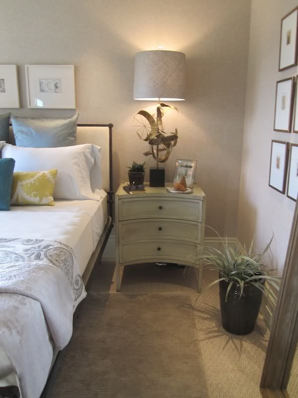
Elizabeth Martin’s Guest Bedroom was simple and calm. I thought her custom designed (by herself) forged iron bed was fantastic. And the Curtis Jere table lamps were beyond amazing. I can’t get them out of my head.
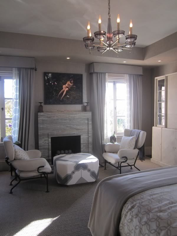
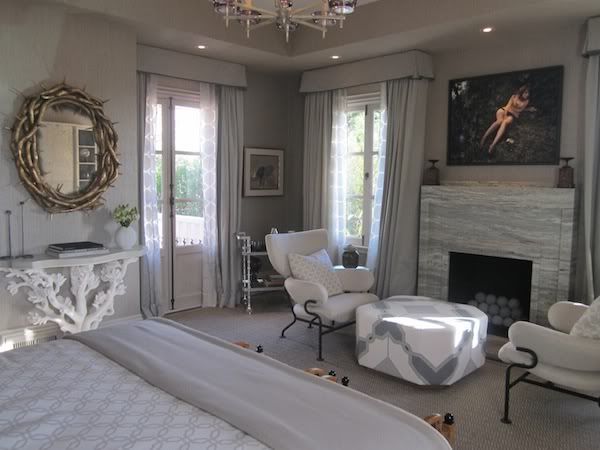
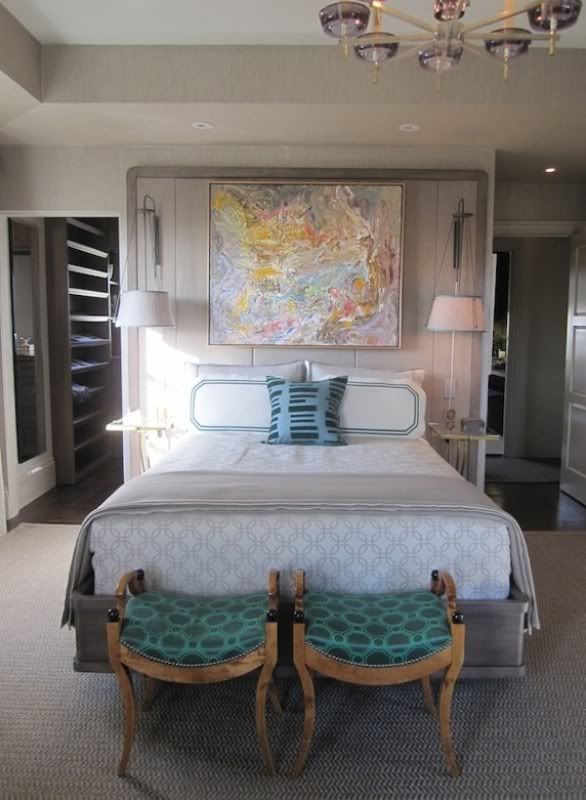
My personal favorite room was Jay Jeffer’s Master Bedroom…it evoked the feeling of being wrapped up in a gray, cashmere throw, sipping a glass of bubbly, with a roaring fire going and Valley of the Dolls on the ’tube…. too much?
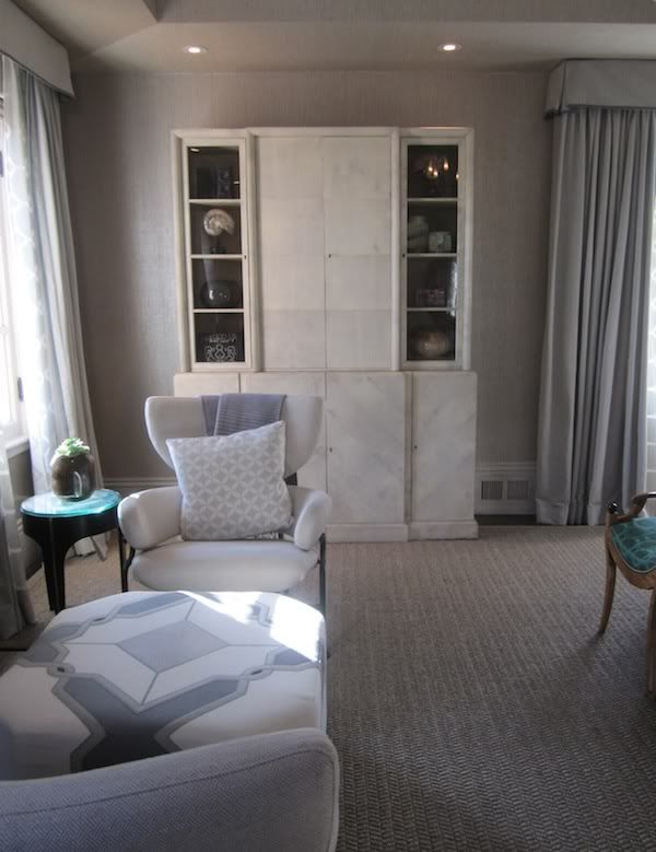
His walls were covered in a silver gray grasscloth, which came across as warm and comforting. The parchment cabinet by Samuel Marx was a showstopper – a creamy jewel of a piece. The silver travertine mantle (by Fox Marble) was perfectly modern without being TOO modern and brought in an interesting pattern. Loved the floor to ceiling headboard with sconces, bar cart, console and pair of club chairs by Franco Albini.
The unexpected pop of malachite green fabric on a pair of 30s Swedish stools was enough to being you back down to earth.
Fabulous job.
ps - all photos by me
Thursday, November 18, 2010
the Rug Company Goes Royal....Alexander McQUEEN....love...
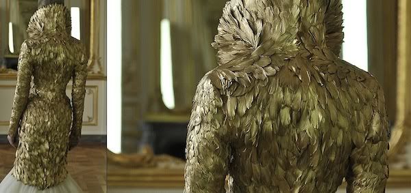
To say that the passing of Alexander McQueen came as a total shock doesn’t get close to what a tragedy his death meant to the world of design. His innovative, forward-thinking and passionate emotion that he thrust into his work maybe was the end all for him. Maybe he gave so much that it left him feeling THAT empty. I don’t know…for someone as talented as him to take their own life leaves me so baffled.
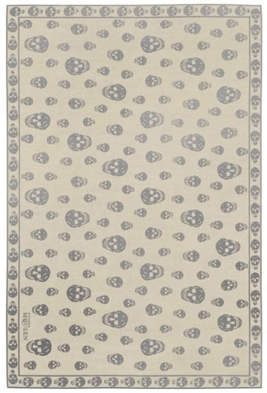
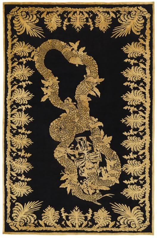
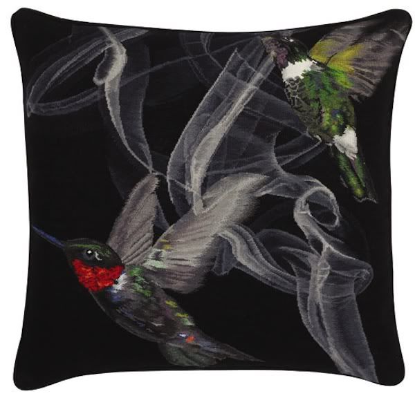
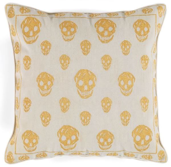
Thank goodness his work lives on and his iconic look (i.e skull) can be re-lived with the Rug Company’s edition of four area rugs and three cushions. I love how his historical-meets-modern world-meets edgy-meets fantasy-meets genius perfectly translates to the Rug Company’s motto of “meticulous craftsmanship with that extra ingredient, the talent of the world’s most distinguished and experienced designers. They know how to combine modern design flair with traditional techniques. They reinvigorate this age-old craft and make us look at the rug with a fresh eye. Together we create rugs that we believe to be precious, unique and to have long-lasting value”.
Enjoy.
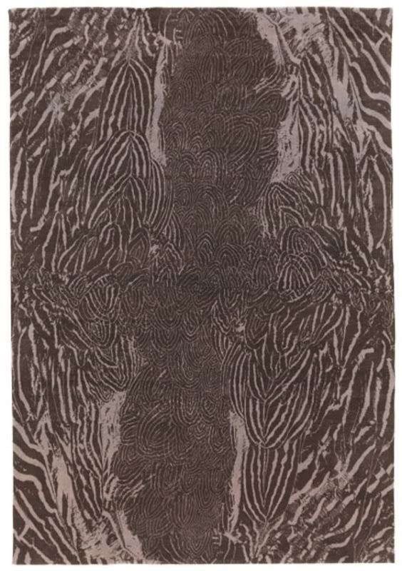
"feathers"....cashmere + wool
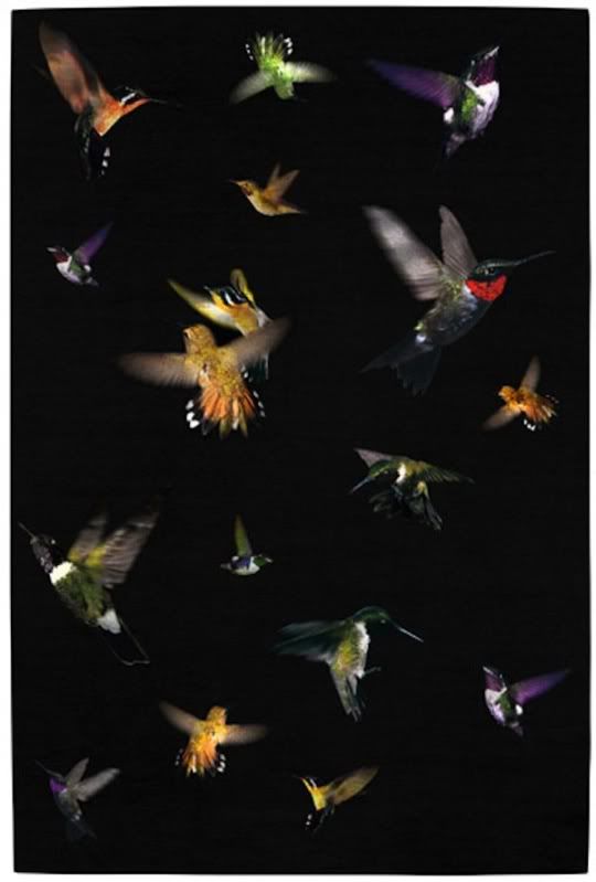
"hummingbird"....wool + metallic thread...i think this would be so amazing in a media room....keep it dark.
"skull"....wool + silk
"military brocade"....wool + silk
"hummingbird cushion"....wool + metallic thread
"skull black"....wool cushion
"skull gold"....wool cushion
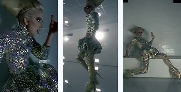
a few of my favorite looks from Fall/Winter 2010 + Spring/Summer 2011 ( i would post every single look from Spring/Summer 2011 by the way...it's beyond.)
all Mcqueen gorgeousness from the Alexander McQueen website.
Thursday, November 11, 2010
finding Daniel Buren in NYC...!
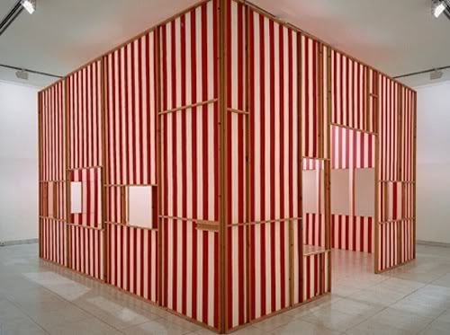
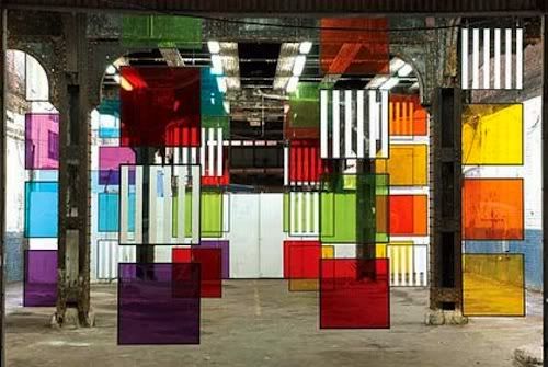
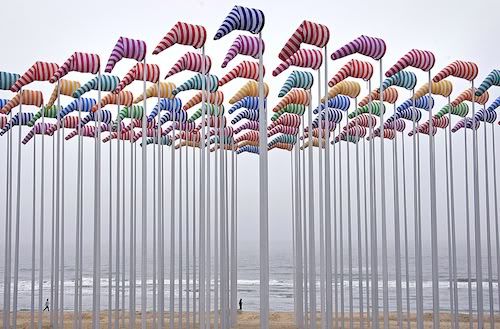
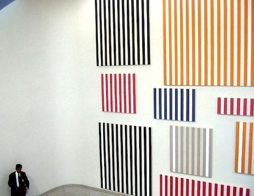
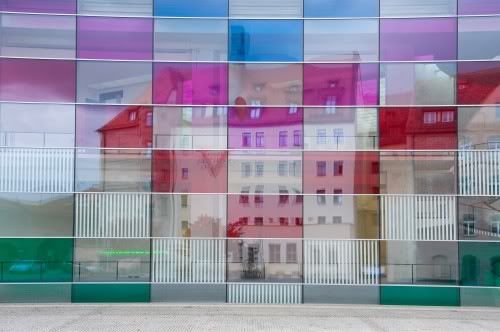
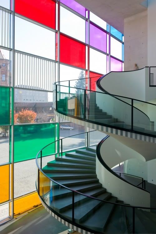
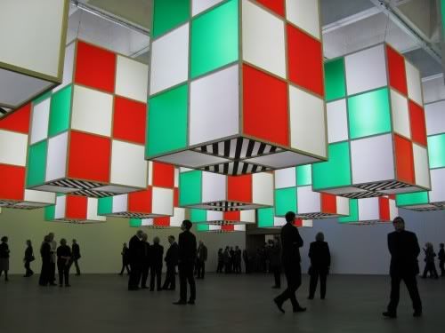
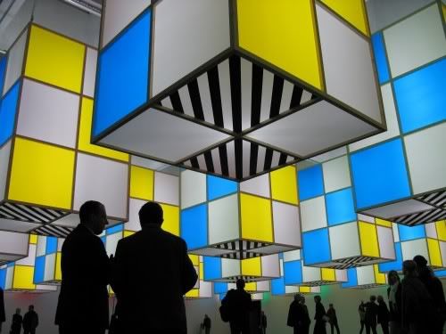
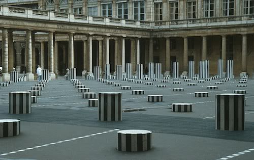
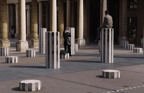
My fascination of the mostly on-site installation art of French, conceptual artist Daniel Buren comes as no surprise with my love of all things graphic and bold. Known as “the Stripe Guy”, Buren uses the hugely popular graphic of French fabric – the stripe – to manipulate and challenge traditional ideas about art and public spaces. What is so intriguing to me is that he uses the same 8.7 cm wide (that is 3.43 inches wide for us centimeter challenged…I just saved you a Google search) stripe over and over again on various surfaces and landmarks. He has been doing this for YEARS. The same stripe. But it is his application that keeps you wanting more. He made headlines in the late 60s by applying what would become his trademark signature to a public space making his art that much more accessible to the viewer/participant rather than the traditional up-on-a-wall-in-a-museum standard of those days. Much like Christo and Jeanne-Claude’s installations, Buren offers a different way to experience and view an environment.
1970's structure
colored screens installed in NY's High-Line, 2007. Photo by Bortolami Dayan.
De Haan, Belgium by Thierry Roge
Murs de peintures...1966-1977
Neus Museum Nuremberg, 2009
Neus Museum Nuremberg, 2009
Neus Museum Nuremberg, 2009
Les Deux Plateaux (The Two Levels), Paris 1986 Installation
Les Deux Plateaux (The Two Levels), Paris 1986 Installation
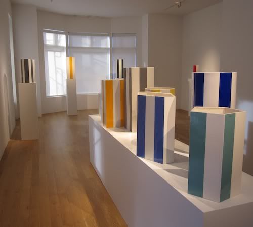
I had seen an exhibition of a show called “Hundred Vases” on Elle Décor’s website and quickly in my two seconds online had dragged the photo to the side to remember to revisit later….not catching the name of the gallery holding the show. I then started looked at more of his works….refreshing my memory on some of his fabulous installations and impressive span of work. I thought I would blog and share with you all because I just fell in love with his work all over. Then things took a cool turn….I went to New York for a client installation last week and on the last day was walking down Madison Avenue with my boss…heading to Barney’s to covet shoes (‘natch) when we passed Freidman & Vallois Gallery. They are known for their beautiful Art Moderne and Deco pieces as well as rare and highly sought after Diego Giacometti pieces. Having recently purchased items from them we thought you know…Barney’s can wait, lets pop in and be prepared to see something truly exquisite and say hello to everyone there. We were not disappointed…besides seeing their amazing collection, I was in for a treat. I saw two cuties packing away what seemed to require some serious packaging and care…being the nosy gal I am I peered over and saw a little sliver of the top of a vase….with 8.7cm stripes running down its white ceramic front…what?! “Ummm…excuse me…is that a Daniel Buren vase” I asked? Why, yes, we have an exclusive show of his upstairs in our gallery right now…its called “Hundred Vases”…would you like to see it?
This is when I just LOVE New York…this is how things work there.
We climbed the stairs and the doors were opened to their beautiful, recently refinished gallery and it was FILLED with the colorful ceramic vases by Daniel Buren. I literally almost cried…I had chills up and down my arms and legs. I know, I know…so silly…but this is the same girl who got teary eyed with the Sound of Music cast reunion on the Today Show the other day…
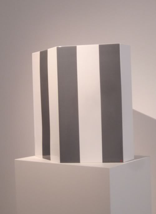
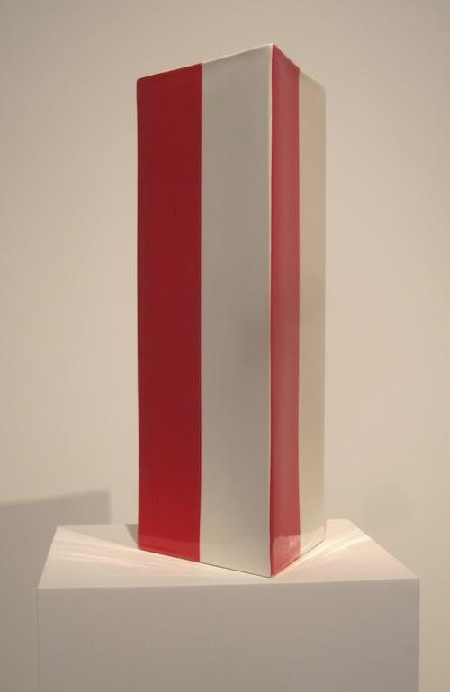
Anyhow, the pieces were spectacular…those gorgeous, perfect stripes in a totally new application and in vibrant colors. They were MUCH bigger than what I thought they would be as well.
gorgeous in gray
vibrant in red
We stayed as long as we could before needing to jump on a plane back to SF….happily giving up an afternoon of shoe shopping at Barney’s and immersed in Buren’s world of stripes.
Soundtrack for this stripey, colorful inspiration equals another talented Frenchie...Miss Edith Piaf, of course!
Subscribe to:
Comments (Atom)


